If you follow me on Facebook or Instagram, you know I have recently been attacking the clutter in my home head on. I am re-evaluting every accessory and piece of home decor that I have. I am sad to say I had a home decor magazine from 2002. First of all, that means I brought it from my other house in the move and of course everything in it is so dated. UGH!! If you’re taking the time to do spring and fall cleaning then you are very in tune with your home. You want things you love to be seen as focal points and not bogged down by clutter. So let’s talk about the biggest mistakes interior designers want you to know about.
Be mindful of how you hang your art. Art is so important that sometimes I start a room from a fabulous piece of art. It is much easier to choose a paint color from a color in your art than to pick paint and then find art, rugs, and pillows to match your paint color. Trust me! Another thing people do is hang the art wrong. The first thing you want to do is think about what kind of wall space you have. Is it a vertical space or a horizontal one? You will see an example of a vertical wall below. Also I’m sure you’ve heard to hang art at eye level. Which is usually a good rule of thumb unless you’re super tall or short. You want to think more in terms of dividing the room in sections. If your room is a normal size 8-10 feet, you want to divide the room into thirds and actually hang the picture in the third section. The black and white picture is definitely on a vertical space so I hung a vertical picture.
Most people pick a rug that is too small. Sometimes you just can’t afford a bigger rug and that is ok. However, if you are just going off of aesthetics a good rule of thumb is to go bigger. Get the biggest one you can afford. You want your front legs of the furniture to be touching the front of the rug. Sometimes a rug is your inspirational piece. Using the rug as a base and then we pull all the accent colors from it. Again, the paint color on the walls would be chosen last. You can see in the picture below that the fronts of the furniture are placed on the rug.
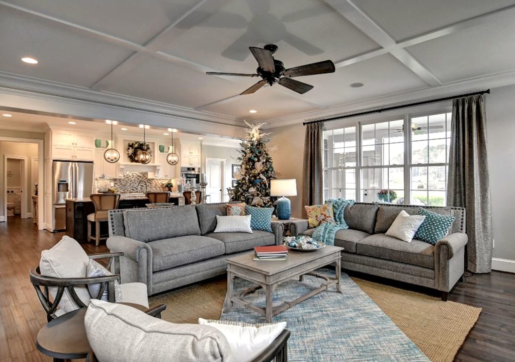
Furniture placement is so important to get the most out of your space. There are 3 main configurations to set up a room. They are in an eleven/parallel shape, U shape, or a square. I use the U shape most often. Most people’s furniture lends its self to that shape. The square gives you the most bang for your buck since you are using seating on all 4 sides of the room. My suggestion is to try your furniture out in several locations to see what works best. If you are about to order new furniture MEASURE and then MEASURE again!! I can’t stress enough that you really need to understand what you are ordering and how much space you have. This is a big deal. You can even put tape on the floor or move pieces of furniture that have similar measurements in the space you are trying to fill. This helps you visualize your plan. The above picture is a U shape.
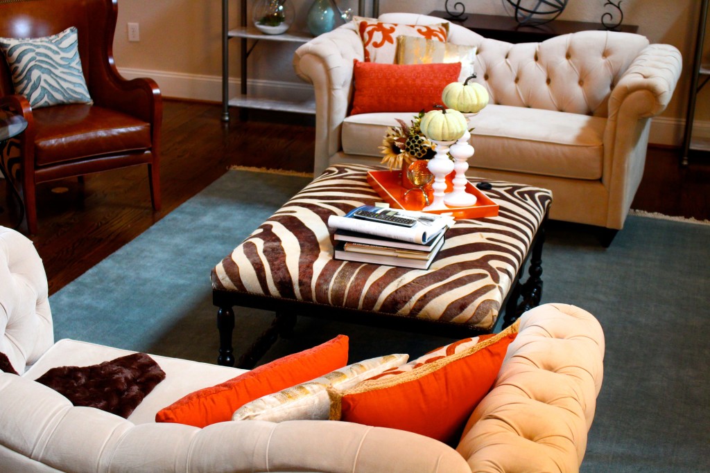
Don’t have all your pieces match too much. Gone are the days where you go to a furniture store and have to buy a set with the couch, love seat, end tables, and coffee table. I have been in rooms like that and that is fine, but they tend to lack personality. You want to get pieces that reflect who you are. Your decorating can come from multiple places. With so many pricing options from fabulous stores like Wayfair and Overstock you really have lots to choose from. I’m going to use the picture below to explain this concept. The couches are from Joss and Main. The chairs were from Horchow. The ottoman is from One Kings Lane and the rug was purchased from Pottery Barn. The end table was one I purchased a long time ago and thought it went nicely in this room. So I literally pulled this room together piece by piece. Luckily, in the end it turned out exactly like I wanted it to.
Not using accessories, lighting or the small details to finish off a room. Interior design is very similar to other areas in your life. When you are getting dressed for a fancy evening I’m sure you add accessories like earrings, a necklace, a fabulous bag, and you can’t forget the shoes. The same goes for design. Adding the finishing details are what make the home personal and truly unique. Pillows, art, rugs, accessories, and lighting all make the room. These items are the jewelry added at the end to give your room that wow factor! Always budget for these items when you are doing a project.
I hope you will learn from these mistakes so you can make your home the best it has ever looked. If you have any questions please leave them below. For other great inspirational ideas follow me on my Pinterest account here.
